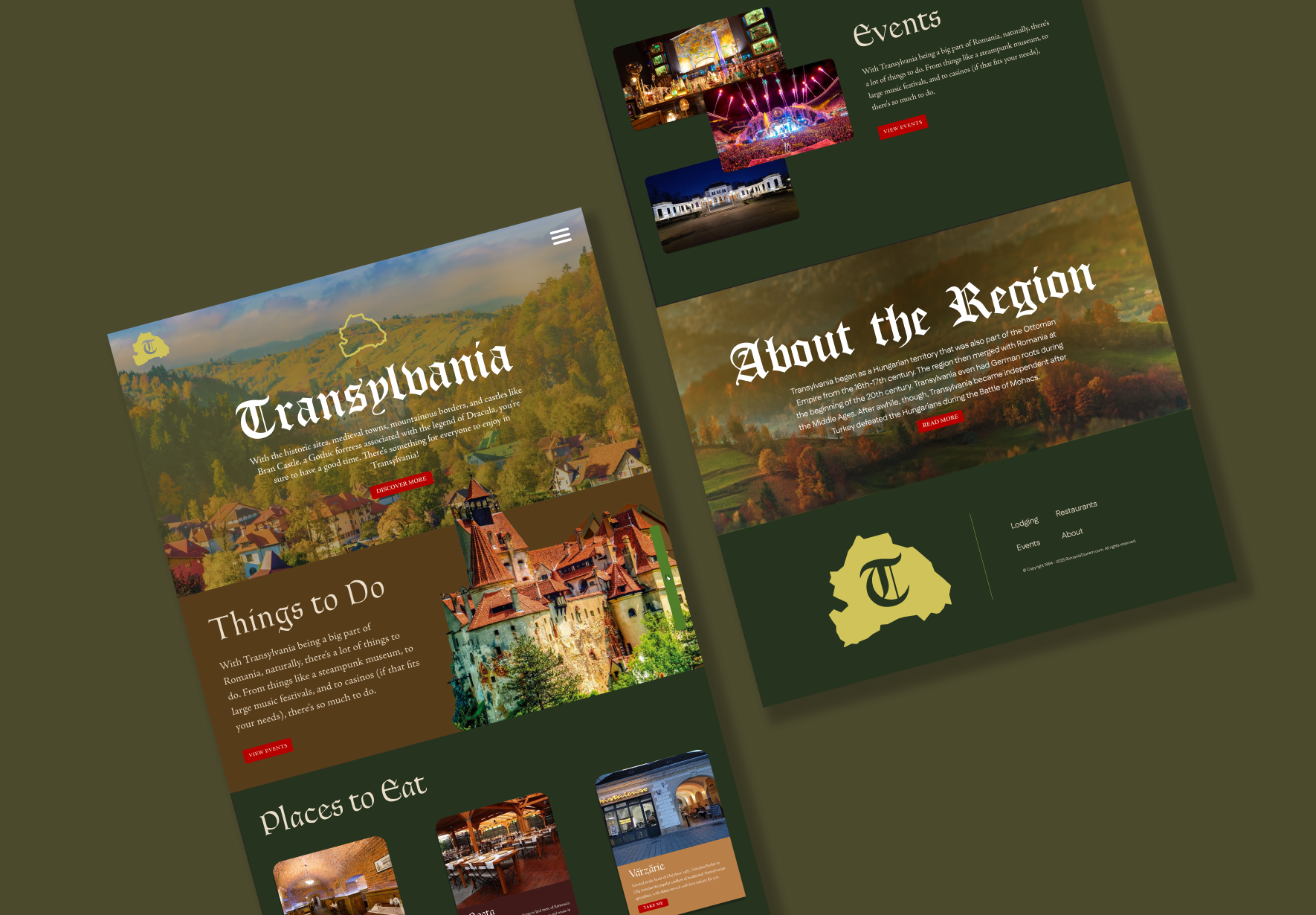
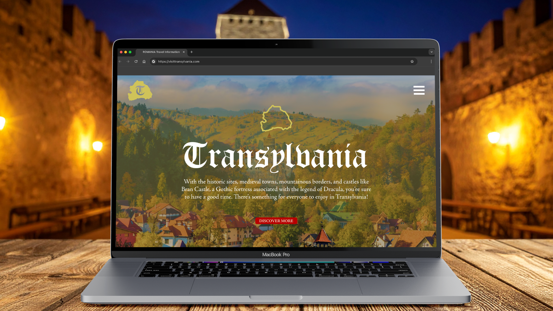
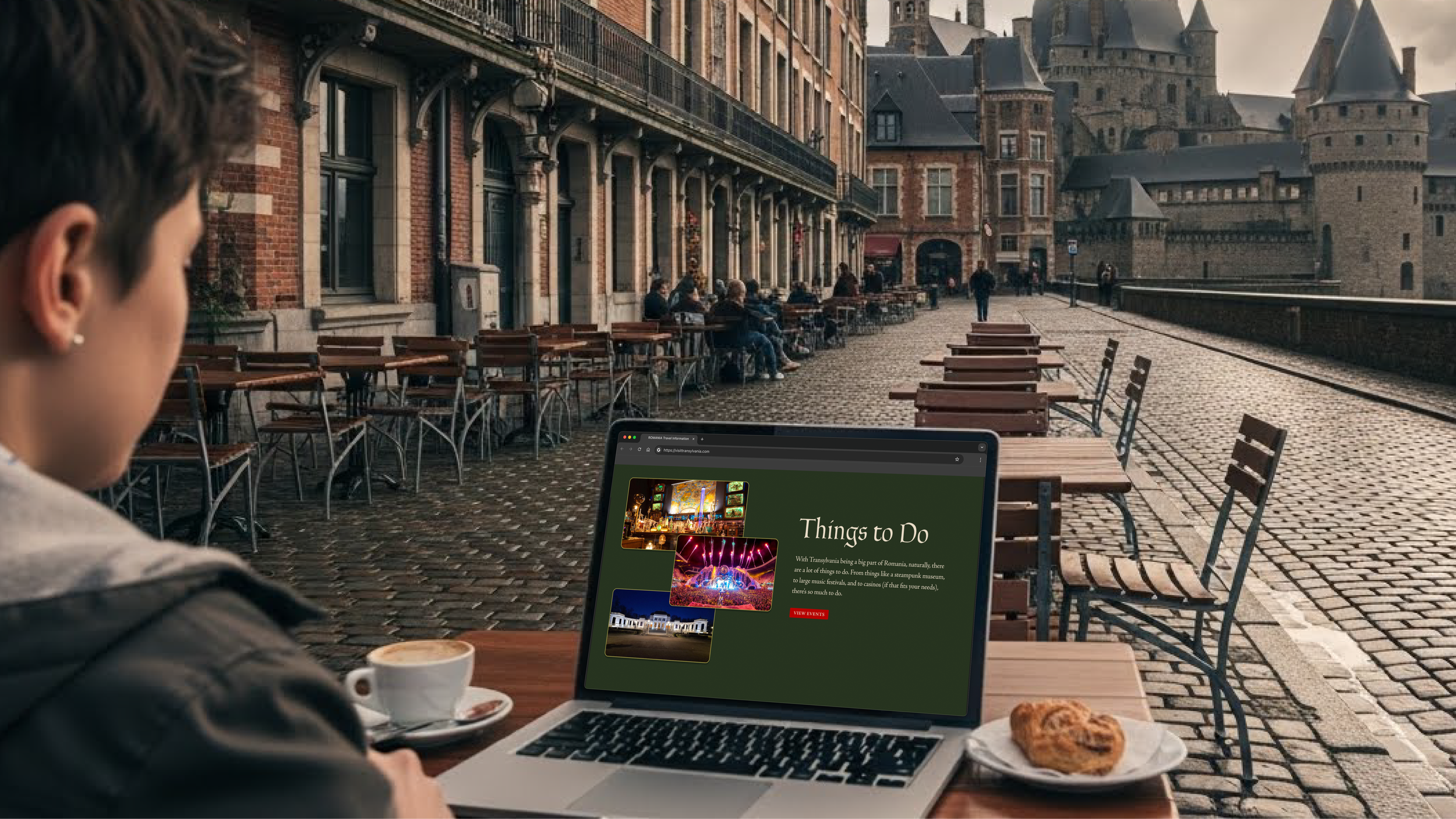
Destination Website
The main issue from the beginning was the lack of character the original website had. Each section looked the same, and the colors didn’t really fit in with the feel of what people see Transylvania as: a gothic and old place. All of this, along with the boring font selection, made the website feel lost and basic. Fixing those, I went in the direction of adding cutout images of buildings in the first section to bring out some depth.