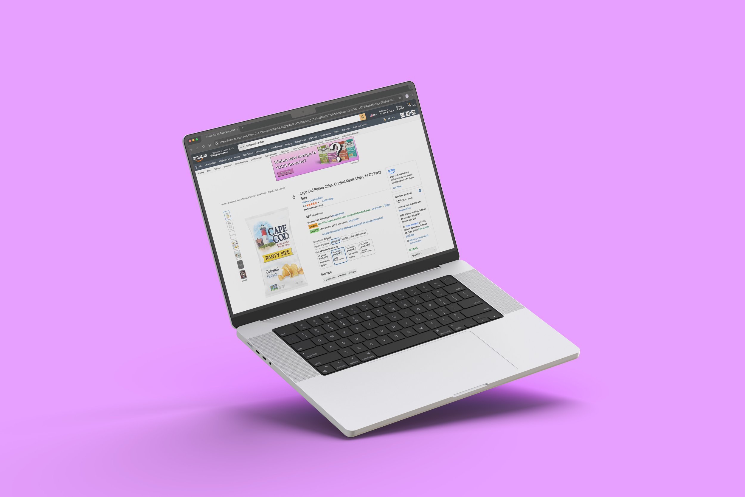
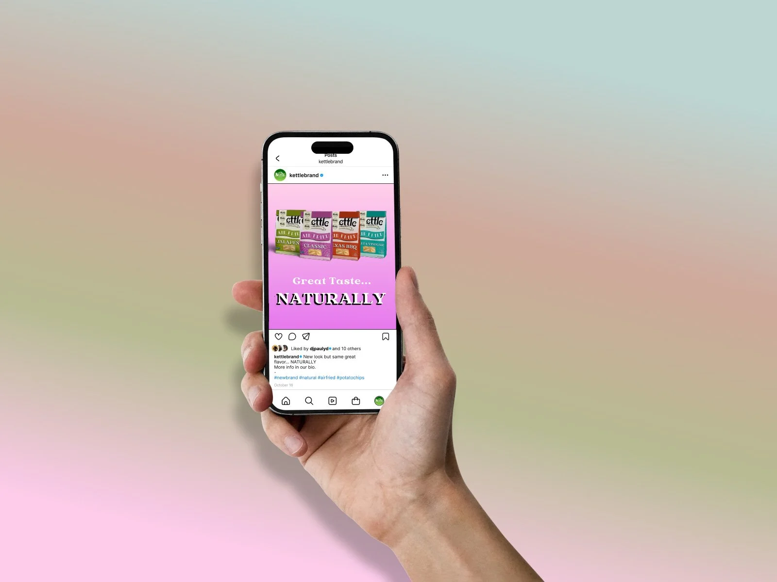
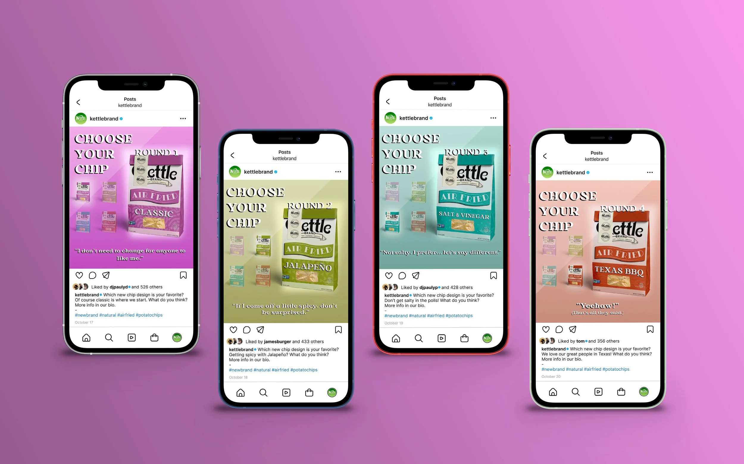
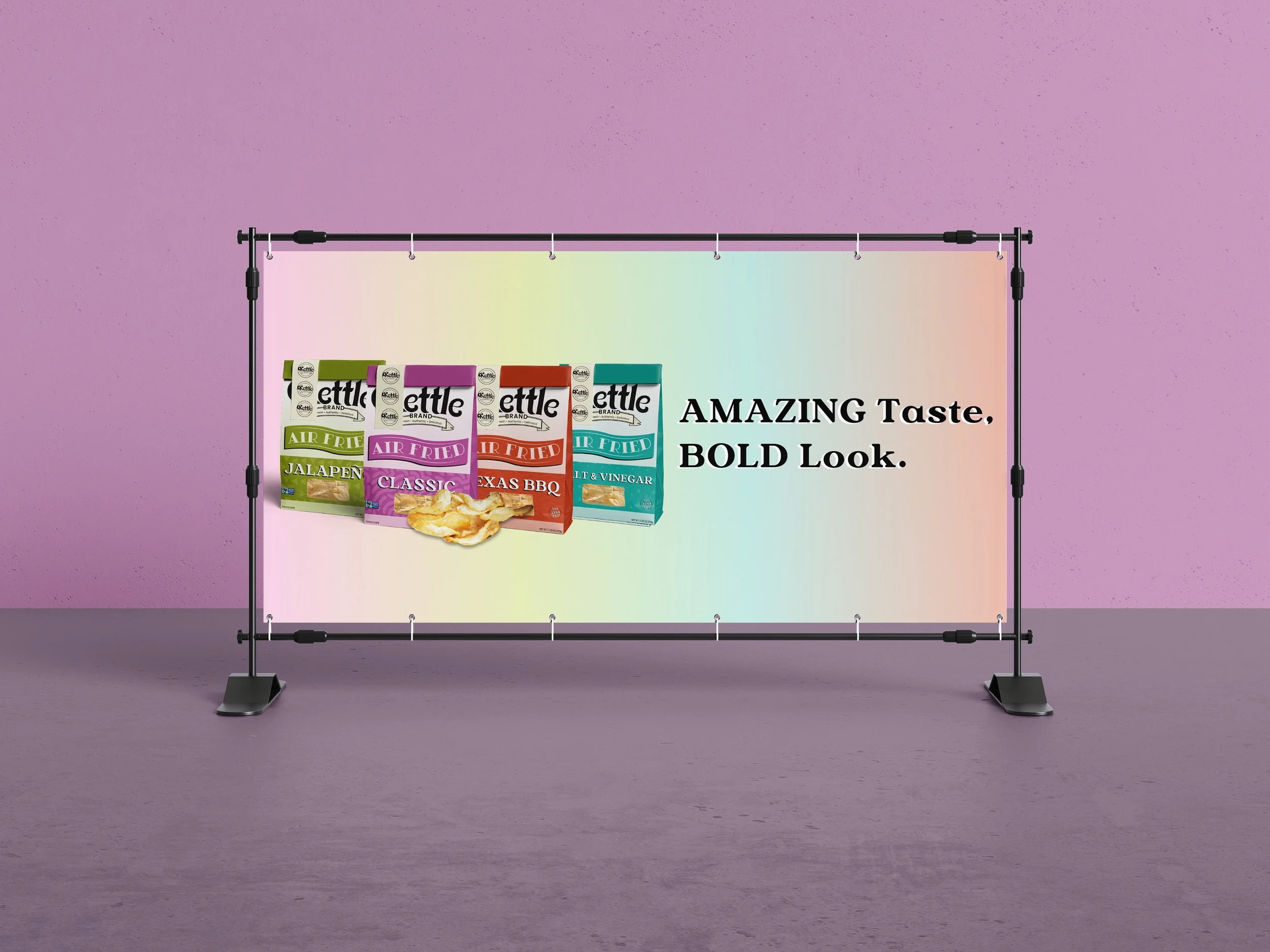
Kettle Air Fried Chips Rebrand
Kettle’s original logo is much too simple and lacks needed character I designed something that was very vibrant and had thick fonts and a bold look. This is because it would make the organic style of food stand out. I leaned into the fun side of the company. The font all looks much more cohesive alongside the new stablished style in the updated design. There is a much more vibrant and bold path. In addition, I added all four flavors from the air-fried line.